
Years ago, before every house had a computer and every child a smartphone, a friend told me he would have none of this modern technology because keeping icons on his desktop smacked of Papism and idolatry.
He may well still have the same objection, but, with so much information intended for an international audience, it’s frequently more efficient to use pictures than words, and communication using symbols and pictograms has become ubiquitous.
Personally, I am fed up with bars and cafés that label the loos with obscure pairs of images or designs that require punters to squint in semi-darkness and then risk embarrassment or offence, or wait, cross-legged, for someone else to reveal the answer to the two-door riddle. A standard door is around 18 square feet, so surely there’s room to write the actual word alongside the ambiguous symbol that panders to art and design enthusiasts among the clientele.
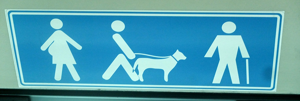
Obviously there are situations, where the space available is to small for words, and graphics must be used, such as the ones in the photo above, for example, which were snapped on a Spanish bus. Of course I know what the sign means, but I can’t help wondering about those strange figures.
The lady bustling in from the left, for example: why should callipygian women have access to priority seating? And just how pronounced should those buttocks be before preferential treatment is justified? What if she’s standing face on to you and you can’t see her behind?
Why is the chap in the middle striding away from the lady with so determined an attitude while his dog is standing motionless? Is the dog waiting for the chap on the right to throw the stick? Is it the repeated throwing of the stick that has allowed the chap on the right to develop such broad shoulders?
The final question is actually a serious one: why is the man on the right made up of straight lines, while the woman, the man in the middle and the dog are all curvy? Is this angularity intended to imply frangibility and lack of elasticity, or has the image simply been taken from a different set of symbols compiled by a different graphic designer?
Of course there are no answers. The sign is simply there to indicate priority seating. And now having wittered on about the sign for quite long enough, I have a justification for posting some entirely unconnected images of seats.
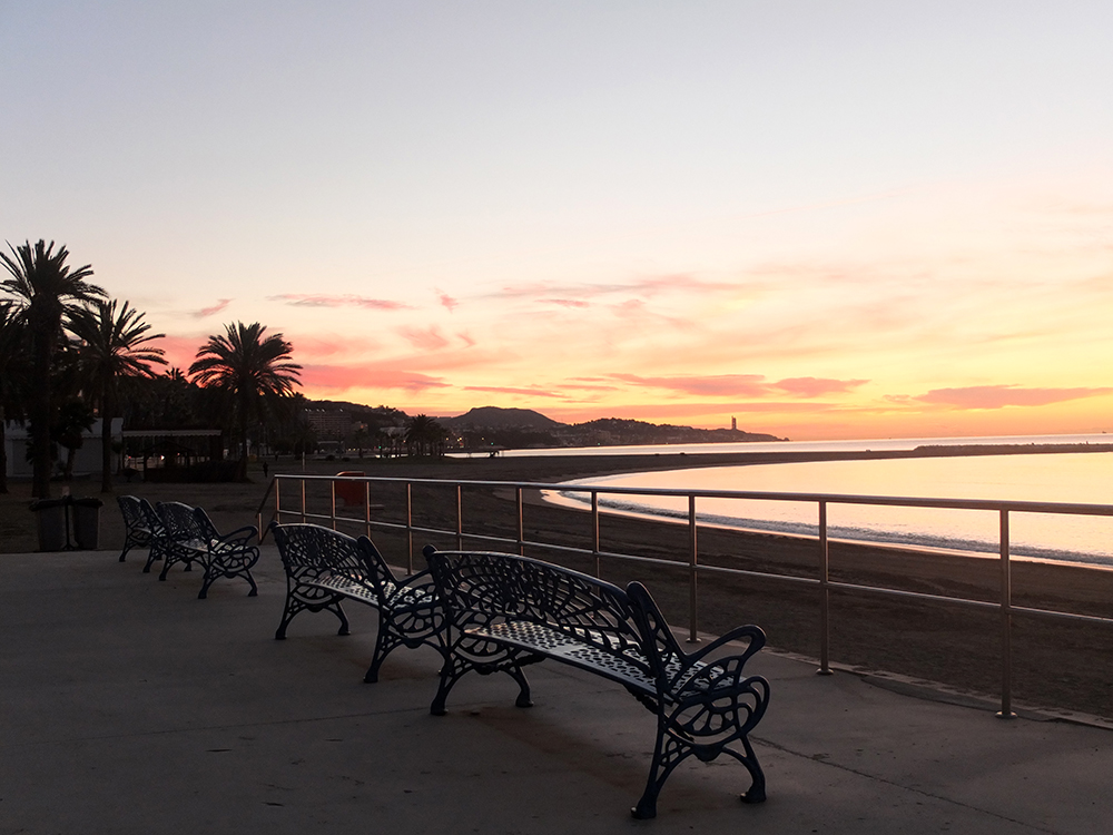
The first one is from Málaga, where the empty benches at sunrise look forlornly towards Africa.
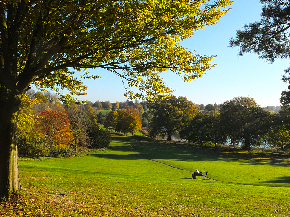
Back in the UK, I’ve never really understood the attraction of this bench: the vantage point from which the photo was taken must surely offer a better view. Next time I’m in the vicinity, perhaps I should remember to walk down and sit there and see what can be seen.
This bench doesn’t have much of a view, but it has its attractions.

Perhaps it is prettiest in springtime.

The UK never had the same café culture as Europe, but I suppose this began to change when cheap package holidays took us to France and Spain and we liked the idea of the pavement café. Then bars started to provide additional spaces outside for smokers, and now there’s plenty of seating on terraces, even though the weather isn’t always very suitable.
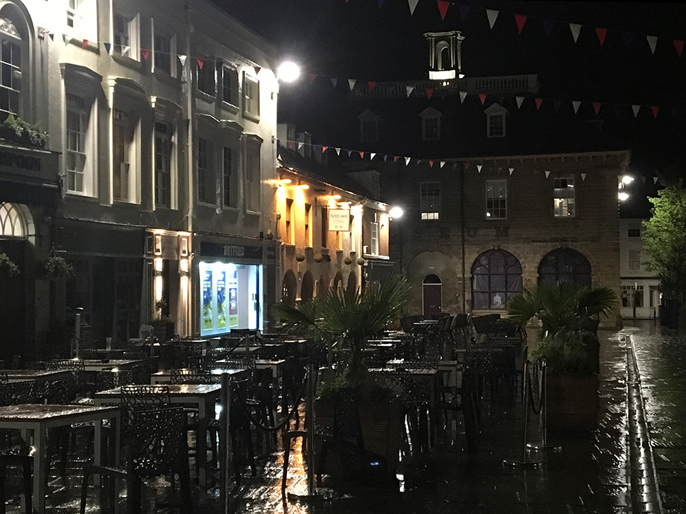
Presumably the fact that the weather can’t be depended on was the reason they decided to create such a spacious indoor café area when they re-built the local station. I don’t suppose it looks quite that bright and clean now it’s been open for a while, although the chairs were wisely chosen to be wipe-clean plastic.
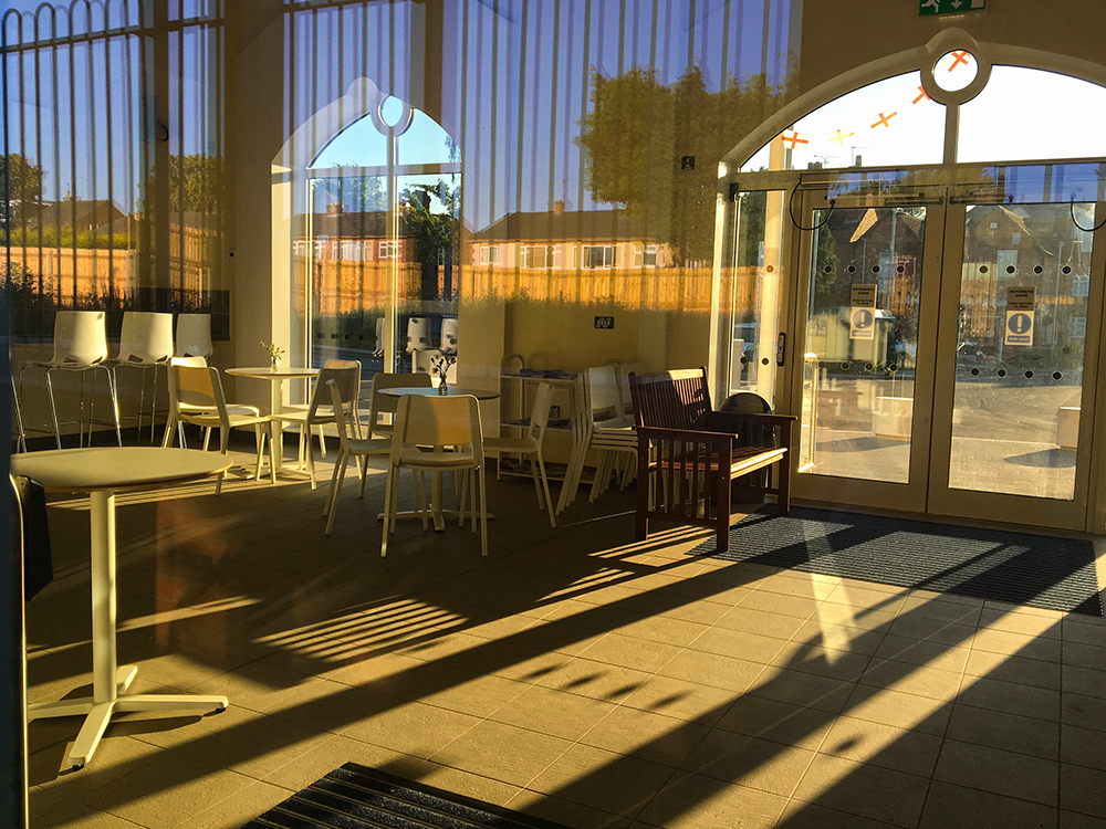
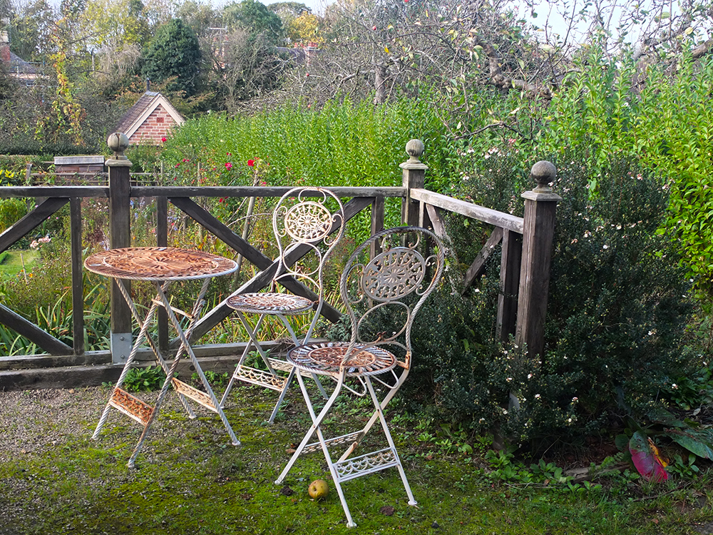
Plastic may be functional but however uncomfortable and unsuitable for the weather here in the UK, the traditional bistro chairs are so much more photogenic.
And acfinal word for those who are wondering about that very first picture. The headless semaphore saints of York Minster combine iconography and visual communication.
I was so hoping it was going to be Wuthering Heights.
